Key Takeaways
- Understanding your brand identity is essential for creating a minimalist logo that effectively communicates your values and resonates with your audience.
- Gather inspiration from existing minimalist logos and utilize negative space to create depth and clarity in your design.
- Refine your logo through multiple sketches, prioritize simplicity, and test its effectiveness across different mediums before finalizing.
Understand Your Brand Identity
Before considering shapes and colors, grasp your brand identity. Your logo should be a reflection of your brand’s core values and personality. A well-crafted logo communicates seriousness and intention about your brand. It’s not just about aesthetics; it’s about conveying a message that resonates with your audience.
Avoid trend-heavy designs to ensure longevity, as they can affect recognition and relevance over time. Focus on timeless, essential elements instead. When designing your logo, consider the following:
- Integrate a brand kit to visualize how different elements of your brand identity work together.
- Consider your business name.
- Consider your tagline.
- Consider your industry.
These elements should work in harmony to create a unique logo that stands out among other logos and images, including your own logo.
Remember, your logo is often the first impression people have of your brand. It should create a sense of brand recognition, making it easier for customers to remember you. Use primary colors that enhance recognition and ensure a cohesive visual identity. Understanding your brand identity lays the foundation for an effective logo.
Gather Inspiration from Minimalist Logo Ideas
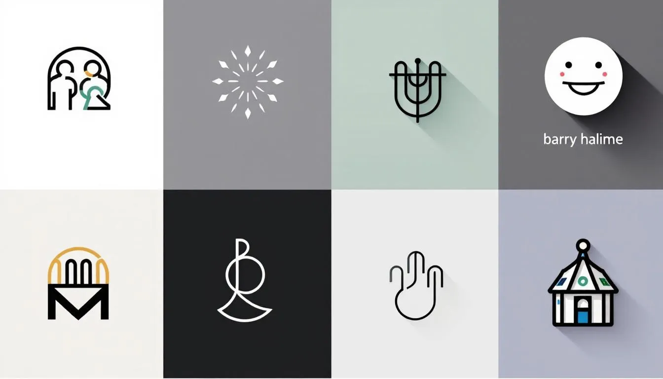
With a solid grasp of your brand identity, gather inspiration next. Many resources offer extensive collections of minimalist logos designed by talented professionals worldwide. These collections can be a treasure trove of minimalist logo ideas that can spark your creativity. When exploring these logos, look at:
- How they use composition
- Their color schemes
- Thematic consistency
- Typography
If you’re not finding what you love, try updating your search with related keywords to yield better results. You can also generate stunning minimalist logos by simply inputting your small business name into various logo design tools. These tools often provide free minimalist logo options that can serve as a great starting point for your design.
Remember, inspiration is just the beginning. Customize and adapt these ideas to fit your unique customization options. Don’t be afraid to combine elements from different logos or add your twist to create a logo that truly represents your brand identity. Start designing with a clear vision in mind, and let the elegance and timelessness of minimalism guide your creativity.
Start with Basic Shapes and Simple Lines
Now that you’re inspired, it’s time to start designing. Minimalist logos often rely on distinctive shapes and typography that convey a brand’s essence without clutter. Start with basic geometric figures like rectangles, circles, and triangles. These shapes ensure neat and proportional designs that are easy to recognize.
Clean lines are crucial in minimalist logo design. They help maintain clarity and recognition at various sizes. Avoid excessive detail and focus on simplicity. The goal is to create a straightforward design that accurately reflects the core values and personality of your brand.
Starting with basic shapes and simple shapes and simple lines lays the groundwork for an elegant and effective new minimalist logo that incorporates geometric shapes and graphics, creating the perfect minimalist logo with a streamlined sophistication.
Experiment with Negative Space

Negative space, or the empty space around and between the elements of a design, can be a powerful tool in minimalist logo design. Minimalist design embraces ‘less is more,’ and negative space plays a significant role in this. Utilizing negative space effectively adds depth and creates a more engaging visual experience without cluttering the design.
Space management is crucial in minimalism. Emphasizing the importance of white space helps create an airy and uncluttered logo appearance. This technique not only enhances the overall aesthetic but also makes the logo more versatile and adaptable to different sizes and mediums.
Negative space allows for clever design elements that convey multiple meanings, enhancing brand storytelling. For example, the FedEx logo uses negative space to create an arrow, symbolizing speed and direction. Experimenting with negative space can result in a visually appealing and meaningful minimalist logo.
Choose the Right Fonts
Typography plays a critical role in minimalist logo design. The right font is key to effectively conveying your logo’s message. Sans-serif fonts are often recommended for a modern and clean aesthetic. They are easy to read and maintain a sleek, professional look that suits minimalist designs.
Refine your logo by adjusting typography and ensuring the font weight aligns with your brands’ message. Bold and clean fonts are essential for easy recognition.
Remember, the custom font you choose should not only be visually appealing but also complement the overall style of your logo. With just a few clicks, you can find the perfect font that enhances your minimalist logo.
Limit Your Color Palette
Minimalist logos often use one or two colors to enhance recognition and clarity. Monochromatic color schemes align with minimalist principles, often using the primary brand color or black and white for simplicity. This approach not only simplifies the design but also ensures consistency across different media.
A color picker can enhance your logo’s color palettes by selecting hues from other documents. Limiting your color palette promotes a cohesive visual identity and makes your logo more adaptable.
Remember, quality in color selection is more important than quantity. Choose your colors wisely to create a minimalist logo that is both striking and memorable.
Sketch Multiple Concepts
Creating various logo sketches allows for rapid idea generation and exploration of different design directions. Start by sketching multiple concepts in black and white to emphasize the logo’s form without the distraction of colors. This approach helps you focus on the basic shapes, illustrations, and overall layout of the logo.
Iterating on multiple concepts before finalizing helps in refining the design based on feedback. Share your sketches with peers or potential customers to communicate their opinions and establish a connection. This feedback can help you choose the most effective design and respond to the needs of your audience.
A good logo design should be effective in both black and white and color. Starting monochromatically ensures the logo maintains its impact across different media. Keep sketching and refining until you achieve a design that resonates with your brand identity and stands out among other logos.
Refine and Customize Your Logo

Refining and customizing your logo is crucial in the design process. Clarity and simplicity should be prioritized to ensure immediate recognition. Focus on readability; your logo fonts should be visually appealing and easy to read.
A limited color palette ensures consistency across different media, making the logo more adaptable. Quality in color selection is more vital than quantity; too many colors can dilute the brand impact. Shades and variations of selected colors can create depth and flexibility in your design.
Testing color rendering is vital; the logo should be recognizable and impactful in both color and black and white. Seek feedback from peers during the testing phase to gauge whether the logo communicates its intended message effectively.
Ensure the logo’s versatility by assessing its scalability, so it remains recognizable in different sizes from small icons to large signs. Consistency in design is key to maintaining a strong visual identity across various platforms.
Test Your Logo

Testing your logo across multiple mediums gauges its effectiveness and visual appeal. Evaluate how your logo appears on:
- Business cards
- Websites
- Merchandise
- And more This ensures your logo maintains quality and recognition when resized.
Evaluate your logo in different applications to ensure it remains impactful. Testing identifies potential issues and allows for adjustments before finalization. An effective minimalist logo should be versatile and maintain its identity across various platforms.
Download and Share Your Logo

Once you have refined and tested your logo, it’s time to download and share it. Here are the steps and options:
- Use tools like LOGO.com’s minimalist logo maker to download your logo instantly.
- Download your logo in formats such as PDF and SVG.
- Preview your logo on various materials before finalizing the design.
After downloading, start using your new logo across all branding materials. Consistent use of your logo helps in building brand recognition and establishing a strong visual identity. Share your logo on your website, social media, and marketing materials to make a lasting impression.
Summary
Creating a minimalist logo involves understanding your brand identity, gathering inspiration, starting with basic shapes, experimenting with negative space, choosing the right fonts, limiting your color palette, sketching multiple concepts, refining and customizing your design, and finally testing it across various mediums. Each step is crucial in crafting a logo that is both elegant and effective.
Remember, the key to a successful minimalist logo is simplicity and clarity. By following these tips, you can create a unique logo that stands out and effectively communicates your brand’s message. So, go ahead and start designing your perfect minimalist logo today!
Frequently Asked Questions
Why is understanding brand identity important in logo design?
Understanding brand identity is crucial in logo design as it ensures your logo authentically represents your brand’s core values, effectively communicates your message, and enhances recognition. A well-aligned logo helps build a strong connection with your audience.
How can I gather inspiration for my minimalist logo?
To gather inspiration for your minimalist logo, analyze professional collections of minimalist logos, focusing on their composition, color schemes, and typography. Use logo design tools to generate ideas that reflect your business name effectively.
What are the benefits of using negative space in logo design?
Using negative space in logo design enhances brand storytelling by adding depth and creating engaging visuals that convey multiple meanings. This clever use of space can make a logo more memorable and impactful.
How important is font selection in minimalist logo design?
Font selection is essential in minimalist logo design, as it effectively communicates the brand’s message. Choosing a modern sans-serif font ensures readability and aligns with a clean aesthetic.
Why should I test my logo across different mediums?
Testing your logo across different mediums is essential to ensure it retains quality and recognition, enhancing its versatility and overall impact. This ensures your branding remains effective no matter how or where it is displayed.
#MinimalistLogo #LogoDesign #BrandIdentity #NegativeSpace #CleanDesign #ModernFonts #GeometricLogo #SimpleBranding #LogoTips #TimelessDesign #BlackAndWhiteLogo #MinimalistInspiration #LogoSketching #ScalableDesign #MinimalistTypography #ProfessionalLogo #MinimalistBranding #LogoMaker #BusinessBranding #CreativeLogo